
Welcome to our blog on website speed optimization! In today’s fast-paced online world, the speed at which your website loads can make or break your online success.
Studies have shown that slow-loading websites not only frustrate users, but also negatively impact search rankings, conversion rates, and overall user experience. According to a study by Google, 53% of mobile site visits are abandoned if a webpage takes longer than 3 seconds to load.
But fear not! In this informative blog, we will explore proven strategies and techniques to help you turbocharge your website’s performance and achieve lightning-fast loading times.
From optimising images and media to leveraging caching and content delivery, we’ll cover all the essential aspects of website speed optimization. So, buckle up and get ready to unlock the need for speed!
Let’s dive in and discover how you can optimise your website for blazing fast performance.
Understanding the Importance of Website Speed
In today’s online world, website speed has become a critical factor in determining the success of a website. It goes beyond just providing a smooth user experience; website speed has significant implications for various aspects of your online presence.
Let’s delve deeper into why website speed matters and how it can impact your website’s performance.
- User Experience: Users have little patience for slow-loading websites. A website that loads quickly provides a positive user experience, keeping visitors engaged and increasing the likelihood of them staying on your site, exploring further, and converting into customers.
- Search Rankings: Major search engines like Google use website speed as one of the factors to determine search rankings. A faster website is more likely to rank higher in search results, leading to increased visibility, organic traffic, and potential customers.
- Conversion Rates: A slow-loading website can significantly impact your conversion rates. Users are more likely to abandon a website that takes too long to load, resulting in lost opportunities for sales, sign-ups, or other desired actions.
- Mobile Experience: With the increasing use of mobile devices for browsing the internet, website speed on mobile devices has become crucial. Mobile users expect fast-loading websites, and slow performance can lead to high bounce rates and lost mobile traffic.
- Competitor Advantage: In a competitive online landscape, having a faster website can provide you with an edge over your competitors. A website that loads quickly can create a positive impression, enhance your brand’s credibility, and give you a competitive advantage.
Achieving fast loading times for your website requires a combination of strategic planning, careful optimisation, and ongoing monitoring.
Let’s get into some proven strategies and techniques that can help you optimise your website for a significant speed boost.
Analysing Your Website's Current Performance
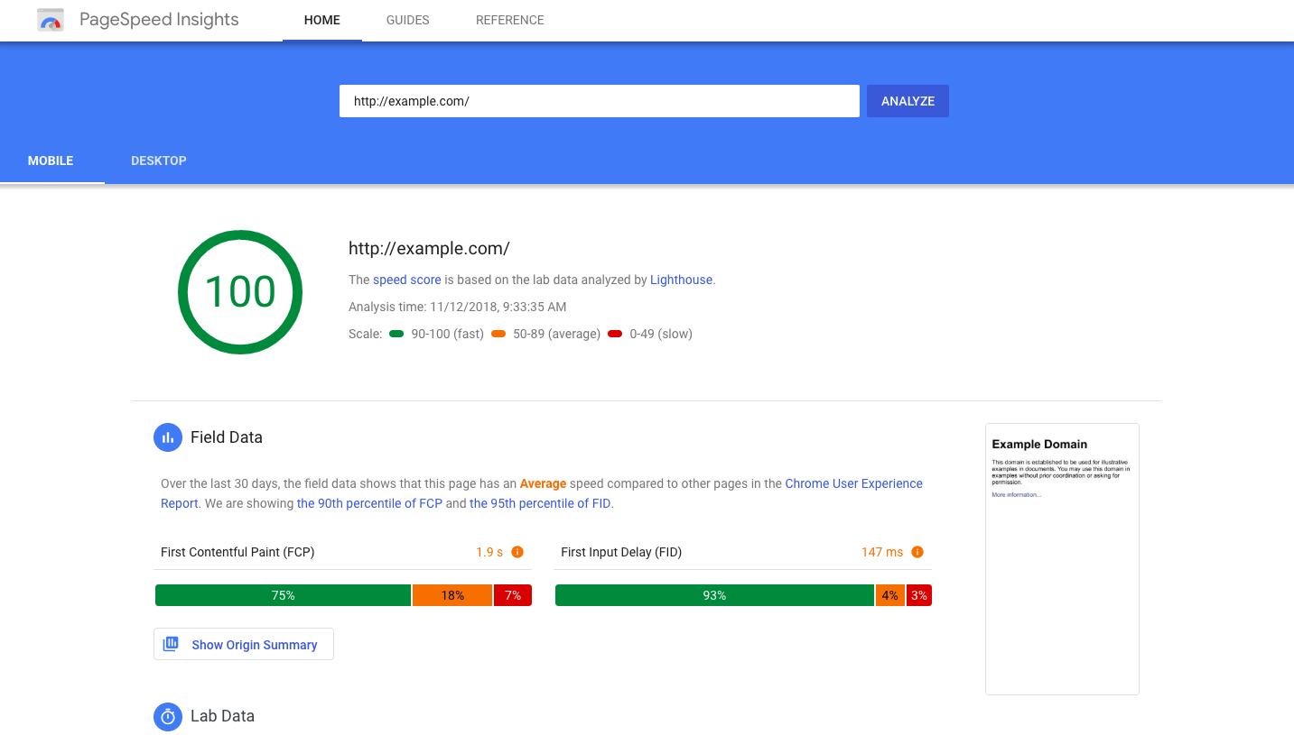
Google PageSpeed Insights
Google PageSpeed Insights is a free online tool provided by Google that allows website owners to assess the performance and speed of their web pages. One of the best parts? You don’t need an account or have to pay any money to use it. All you need is the URL of the website you want to test.
How to Use Google PageSpeed Insights
Using Google PageSpeed Insights is easy. Simply go to the PageSpeed Insights website, enter the URL of the web page you want to test, and click the “Analyse” button. The tool will then analyse the web page and provide you with a performance score, along with detailed recommendations on how to optimise the page for better speed and performance.
What Does the Score Mean?
PageSpeed Insights generates a performance score, which ranges from 0 to 100, with a higher score indicating better performance. The score is divided into three categories: Good, Needs Improvement, and Poor. The tool also provides a detailed breakdown of the performance of different aspects of the web page, such as server response time, render-blocking resources, image optimization, and more.
Tips for Using PageSpeed Insights
- Pay attention to the performance score: Aim for a high score as it indicates better website performance.
- Review the recommendations: PageSpeed Insights provides detailed recommendations on how to optimize different aspects of your website. Pay close attention to these recommendations and prioritize them based on their impact on performance.
- Take action on critical issues: PageSpeed Insights identifies critical issues that have a significant impact on website performance. Make sure to address these issues first to achieve noticeable improvements in speed and performance.
- Test on multiple devices: PageSpeed Insights provides performance insights for both mobile and desktop devices. Test your website on both to ensure optimal performance across different platforms.
- Regularly retest your website: Website performance can change over time due to updates or changes on your site. Regularly retest your website with PageSpeed Insights to identify any new performance issues that may have arisen.
Google PageSpeed Insights is a valuable tool for website owners to assess and optimise their website’s speed and performance. It’s easy to use, provides detailed recommendations, and can help you achieve a better user experience, higher search rankings, and increased conversion rates. Give it a try and start optimising your website for better performance today!
WebPageTest
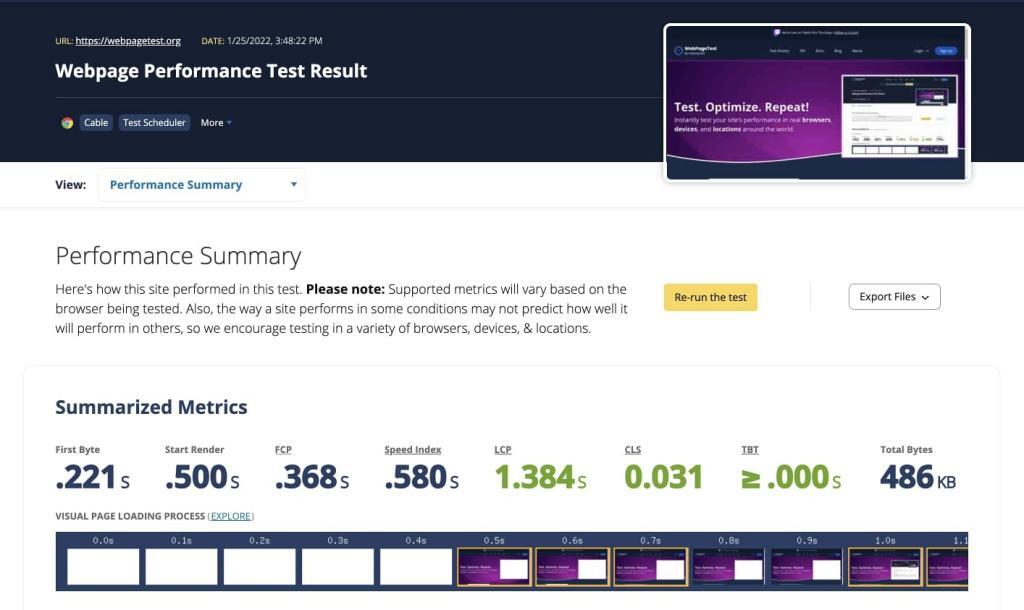
WebPageTest is a free online tool that allows website owners to test and analyse the performance of their web pages. It provides detailed insights into various aspects of web page performance, including load time, rendering, and other optimisation opportunities.
How to Use WebPageTest
Using WebPageTest is straightforward. Simply go to the WebPageTest website, enter the URL of the web page you want to test, and select the test location. You can choose from multiple test locations around the world to assess the performance of your web page from different geographic regions.
After initiating the test, WebPageTest will analyse the web page and provide you with a detailed performance report.
Understanding the Performance Report
WebPageTest is an open source tool that generates a comprehensive performance report that includes various metrics, such as load time, first contentful paint (FCP), fully loaded time, and more. It also provides visual representations of the web page’s rendering process, showing how content is loaded and displayed on the screen.
The performance report also highlights optimisation opportunities, such as image compression, script minification, and more.
Tips for Using WebPageTest
- Focus on time to first byte (TTFB): TTFB is a crucial metric that represents the time taken by the server to respond to the initial request. A lower TTFB indicates faster server response times, which can significantly impact the overall load time of your web pages.
- Leverage the filmstrip view: WebPageTest’s filmstrip view shows a timeline of how your web page renders, allowing you to identify and address any content rendering issues. Use this feature to optimise the rendering process and improve user experience.
- Check waterfall chart for resource loading: The waterfall chart in WebPageTest displays the loading sequence and timings of each resource on your web page. Use it to identify and optimise slow-loading resources, such as large images, CSS, or JavaScript files.
- Test with different connection speeds: WebPageTest allows you to test your web pages with different connection speeds, simulating various internet connections. Test your web pages with different connection speeds to assess performance in real-world scenarios and optimise accordingly.
- Test on different devices: WebPageTest allows you to test your web pages on different devices, such as desktops, mobiles, and tablets. Test on different devices to evaluate performance across different platforms and optimise for a seamless user experience.
- Compare test results: WebPageTest allows you to compare test results from different test locations, devices, or connection speeds. Use this feature to identify performance discrepancies and optimise your web pages accordingly.
WebPageTest, like Google PageSpeed Insights, is a powerful tool for website owners to assess and optimise the performance of their web pages.
PageSpeed Insights Vs WebPageTest
While both tools provide valuable insights, WebPageTest offers additional benefits such as the ability to test with different connection speeds, simulate different devices, and compare test results from various test locations.
By leveraging these unique features, WebPageTest allows you to identify and address performance bottlenecks, optimise resources, and enhance user experience.
Incorporating WebPageTest into your website optimisation workflow can help ensure high-performing web pages that provide an optimal experience for your visitors.
Optimising Images and Media
Let’s get stuck into the world of optimising images and media for your website, even if you’re not a tech-savvy guru. We’ll break it down into simple, actionable steps that can help improve your website’s performance and make it load faster for your visitors.
Image Compression
Think of image compression as a way to shrink the size of your images without sacrificing quality. You can use handy tools like JPEG Optimizer, PNGGauntlet, or TinyPNG, which work like magic to reduce the file size of your images while maintaining their visual appeal. It’s like putting your images on a diet, making them leaner and faster to load.
Modern Image Formats
Just like how you might upgrade to a sleeker smartphone, you can upgrade your images to modern formats like WebP. These formats are more efficient and can result in smaller file sizes (which google really likes), which means faster load times for your website.
You can convert your images to WebP using online converters (like sqoosh) or image editing software (such as gimp), and then implement them on your website using HTML elements like the picture or source element.
Lazy Loading
Lazy loading is like a smart way of saving resources by only loading what’s needed when it’s needed. You can use JavaScript libraries like LazyLoad or built-in browser features like the loading attribute to defer the loading of images and other media files until they are about to be displayed on the user’s screen. It’s kind of like only bringing out the snacks when your guests are ready to munch on them.
Video and Media Optimisation
Videos and other media files can be big and bulky, slowing down your website’s load times. But fear not! You can compress videos using tools like HandBrake or Adobe Media Encoder, and optimise audio files using codecs like Opus or AAC.
You can also leverage video hosting platforms like YouTube or Vimeo to serve optimised media files on your website, so your visitors can enjoy speedy load times without compromising on quality.
Responsive Images
Think of responsive images as chameleons that adapt to different devices and screen sizes. You can use HTML attributes like srcset and sizes to provide different image sources based on the user’s device, ensuring that they get the most optimal image for their screen.
It’s like giving your website a wardrobe makeover, so it looks fabulous on all devices, including mobile phones and tablets.
Content Delivery Networks (CDNs)
Content Delivery Networks, or CDNs, are like a team of superheroes that work together to make your website lightning fast. You can sign up for a CDN service like Cloudflare, Amazon CloudFront, or Akamai, and configure it to distribute media files across multiple servers worldwide.
This way, your visitors can get the files from a server that’s closer to them, reducing waiting time and making your website load faster, no matter where they are in the world.
Minimise Requests and Use Caching
Think of requests as little messages your website sends to the server, asking for files. The more requests your website makes, the longer it takes to load. So, to speed things up, you can minimise the number of images and media files on your page.
You can also leverage browser caching, which is like storing files locally on the user’s device so they don’t have to be fetched from the server every time. It’s like having your favourite snacks already stocked up in your pantry, so you can grab them quickly whenever you want without going back and forth to the store.
Caching and Content Delivery
By implementing caching and content delivery, website owners can greatly improve website speed and performance, resulting in faster loading times, better user experience, and higher search engine rankings.
Caching
Caching is like having a “shortcut” for frequently accessed website data. Instead of generating or loading the same data every time a user visits a web page, the data is temporarily stored in a special location, such as the user’s browser or a server, so it can be quickly retrieved without starting from scratch. This can significantly speed up web page loading times.
Some popular caching tools for websites include plugins like W3 Total Cache or WP Super Cache for WordPress websites, or server-level caching solutions like Varnish or NGINX for server-side caching. These tools allow you to enable caching on your website and customise settings to optimise the caching process for your specific website.
Content Delivery
Content Delivery involves distributing website content across multiple servers located in different geographic locations, called Content Delivery Network (CDN) servers. When a user requests a web page, the content is delivered from the nearest CDN server, reducing the time it takes for the content to travel from the server to the user’s device.
CDN services like Cloudflare, Amazon CloudFront, or Akamai, are popular choices for implementing content delivery. These services allow you to distribute your website content to servers in various locations globally, ensuring that the content is delivered from a server that is closest to the user’s location, reducing latency and improving load times.
Minimising Code and Scripts
Minimising code and scripts is crucial for website owners as it helps to reduce the size of code files, decrease the number of requests needed to fetch external files, and ultimately improve the loading times of their web pages.
This results in a faster and more efficient website, delivering a seamless and smooth user experience for visitors.
Code Minification
Code minification is the process of removing unnecessary characters, spaces, and comments from the code files of a website, making the code more compact and efficient. This can help reduce the file size of the code and improve the loading time of web pages.
There are various online tools and plugins available, such as UglifyJS, JSMin, or Super Minify, that can automatically minify your JavaScript, CSS, and HTML code. These tools help remove unnecessary code elements while preserving the functionality of the website.
Script Consolidation
Script consolidation involves combining multiple JavaScript or CSS files into a single file. This reduces the number of requests needed to fetch external files, reducing the overhead of HTTP requests and improving the page load times.
You can manually combine and minify JavaScript and CSS files into a single file, or use automated tools like Grunt or Gulp, which are task runners that can help automate the process of script consolidation, minification, and optimization.
Ensuring Fast Loading on Mobile Devices
Ensuring fast loading on mobile devices is paramount for website owners, as mobile browsing has become increasingly prevalent. Optimising web pages for mobile devices is essential to provide a seamless and speedy experience for mobile users.
This involves techniques such as responsive design, mobile-first development, and optimising content and images for mobile devices. Additionally, leveraging tools and techniques such as AMP (Accelerated Mobile Pages), mobile caching, and mobile-specific content delivery networks (CDNs) can further enhance website performance on mobile devices, ensuring quick loading times and smooth browsing experience for mobile users.
For more in-depth information on mobile SEO, be sure to check out our other blog “Mobile SEO: The Essential Guide for Beginners“.
It’s a valuable resource that provides comprehensive insights and tips on optimising your website for mobile devices, including techniques to improve website performance, mobile-friendly design, and mobile SEO best practices.
With the increasing usage of mobile devices for browsing, it’s crucial to ensure that your website loads quickly and functions smoothly on mobile devices to provide a seamless experience for your mobile visitors.
Evaluating and Fine-Tuning Your Website's Speed
After optimising your website for speed using various techniques, it’s crucial to evaluate and fine-tune its performance to achieve desired results. Here are some tips:
- Monitor Website Performance: Use tools like Google Analytics to track metrics such as page load time, server response time, and user engagement to identify areas for improvement.
- Conduct Speed Tests: Regularly test your website’s speed using tools like Google PageSpeed Insights or WebPageTest for insights and recommendations.
- Review Server and Hosting Configuration: Optimise your server and hosting configuration, including using a Content Delivery Network (CDN) to distribute content globally.
- Optimise Code and Scripts: Review and optimise your website’s code and scripts by minifying, removing unnecessary code, and compressing files.
- Optimise Images and Media: Continuously optimise images and media files by compressing images, using modern image formats like WebP, implementing lazy loading, and leveraging responsive images.
- Test on Different Devices and Browsers: Test your website on various devices, browsers, and network conditions to ensure it loads quickly and functions properly.
- User Testing: Gather feedback from real users through usability testing or surveys to identify any issues and make necessary improvements.
Regularly evaluating and fine-tuning your website’s speed, you can ensure optimal performance and a fast, smooth experience for your visitors, regardless of their device or network conditions.
Thank you for reading! We’re passionate about continuously improving load speeds and optimising website performance.
Don’t forget to check out our other blogs for more valuable insights on website optimisation, mobile SEO, and other helpful tips.
If you have any questions or need further assistance, feel free to reach out. Happy optimising!
