What is Mobile SEO?
Mobile SEO refers to the process of optimising a website for search engine visibility and usability on mobile devices such as smartphones and tablets.
With the huge increase of mobile internet usage (60% of all traffic is mobile), optimising a website for mobile is crucial for maintaining or improving search engine rankings and providing a seamless user experience for mobile visitors.
Mobile SEO involves 6 main strategies that differ from desktop SEO. These best practises include:
- Mobile-friendly design
- Page speed optimisation
- Mobile-specific keywords
- Voice Searches
- Local SEO for mobile
- Mobile-friendly content
We’re going to help you enhance your visibility in mobile search results, attract more mobile traffic, and provide a positive experience for mobile users, by learning how to meet these 6 requirements.
Targeting Mobile Specific Searches
Targeting mobile search queries involves optimising your website and content to tailor specifically to users searching on mobile devices. At first thought you might not think searches on mobile are any different, but there’s a couple things you need to take into consideration.
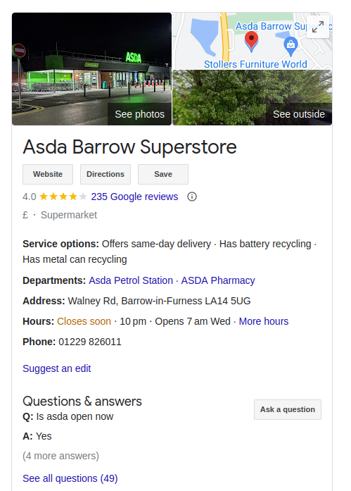
Local Searches for Mobile
People on mobiles are often out and looking for information for things nearby. Optimise your website for local searches by including location-based keywords and phrases in your content, meta tags, and headings.
This helps your website appear in local search results when users are searching for nearby businesses or services on their mobile devices.
And don’t forget to have your Google My Business profile up-to-date. If you’re not sure how to do that check out our article on how to setup and optimise your Google My Business.

Voice Search Optimisation
Voice search is becoming increasingly popular on mobile devices, whether it’s because people don’t want to type or just have their hands full. Voice searches have a very different structure to searches that are typed.
Optimise your content for voice search queries by using natural language and conversational keywords. These sort of keywords are a bit longer and more casual.
Structured Data Markup
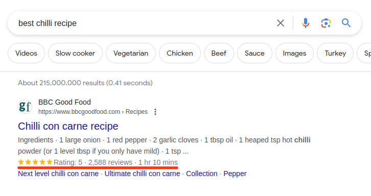
Implement structured data markup on your website to help search engines understand your content and display rich snippets in mobile search results.
These rich snippets can include additional information such as images, ratings, or prices helping users to identify your site. This can improve the visibility and click-through rates of your listings on mobile devices.

Website Design for Mobile Users
In order fir your website to rank high you need visitors, and you need those visitors to be happy and stay on your site. If you’re site is difficult to use or navigate on mobile people will leave, damaging your bounce rate.
Google uses the bounce rate as one metric to determine how relevant and high quality your content is, the more people that quickly leave the harder it will be for you to rank high.
You need your website design to be mobile-friendly and responsive. To ensure that your website is fully responsive you should follow these best practices.
Use a Responsive Web Design (RWD) Framework
Choose a responsive framework or platform for your website. Frameworks such as Bootstrap or Foundation, have automatically adjusting the layout and design based on the user’s device and screen size.
Implement Fluid Grid Layouts
Use percentages instead of fixed pixels for defining widths of elements, allowing them to resize fluidly as the screen size changes.
For mobile you want to rely less on pixels in general as dimension of screens vary so much, this goes for font sizes as well. Try to use REM or EM when setting font sizes in mobile.
Priorities Content Hierarchy
Priorities the most important content and calls-to-action for mobile users. Keep the layout simple and streamlined to avoid clutter.
You need to remember the screens are a lot smaller do not try to cram everything on, you need to reduce the clutter and direct visitors to where they need to go.
Create Touch-Friendly Navigation
Implement large, easily clickable buttons or links for navigation elements to accommodate touch interactions on mobile devices. Ensure there is enough space between links to prevent accidental taps.
Make sure to be careful when creating headers and menu designs as these can be especially difficult on mobile.
Test Across Multiple Devices
Regularly test your website’s responsiveness across various devices, screen sizes, and orientations using tools like Google’s Mobile-Friendly Test or browser developer tools. Make adjustments as needed to ensure a consistent and optimal user experience.
Does your Website Load on 3G?
People making searches on their mobile phones are doing it for a reason, they want to be mobile. These people are often out and about they’re not sat at a desktop with a reliable Wi-Fi connection.
You need your website to be able to load even if a user has poor mobile data reception, you can’t rely on them to all have 5G.
To achieve optimal page speed on mobile devices, it’s essential to minimise file sizes (such as images, CSS, and JavaScript), leverage browser caching to reduce server requests, and optimise server response times.
Doing all of this can be a bit tedious but is definitely worth it. To learn how to optimise your website speed check out our other article: Website Speed Optimisation.
Making your Content Mobile Friendly
You need to completely rethink and re-structure your content for mobile. Mobile users have different needs and expectations, you can’t rely on large blocks of text. Due to the limited screen size you need your website content to be direct and clear.
To make your content more mobile-friendly and ensure a positive user experience on mobile devices, consider implementing the following strategies:
Use Clear and Concise Headings
Break up your content into easily scannable sections with clear headings and subheadings. This helps mobile users quickly find the information they’re looking for and navigate your content more efficiently.
Optimise Text Size and Line Length
Use legible font sizes and line lengths that are comfortable to read on smaller screens. Avoid long paragraphs and large blocks of text, which can be difficult to read on mobile devices.
You might be inclined to make text smaller so you can fit more text on the screen, do not do this. Focus on how you can condense the message or information you want to share.
Keep Paragraphs and Sentences Short
Write concise paragraphs and sentences to maintain readability on mobile devices. Aim for shorter paragraphs and sentences to make it easier for users to digest your content on small screens.
Minimise Use of Pop-ups and Interstitials
Avoid intrusive pop-ups and interstitials that can disrupt the user experience on mobile devices. If necessary, use non-intrusive banners or overlays that are easy to dismiss on small screens.
Prioritise Above-the-Fold Content
Place important content and calls-to-action (CTAs) above the fold to ensure they are immediately visible to mobile users without the need for scrolling. Mobile users have limited screen space, so prioritise content that captures their attention quickly.
Optimising Mobile for the Future
Making your content mobile-friendly is just the beginning. Businesses must embrace new mobile SEO strategies. This involves not only adjusting content but also focusing on technical aspects that enhance the mobile user experience and improve search engine performance.
Google Search Console is an essential tool in this process. It helps you monitor and optimise your site’s performance on both desktop and mobile. Regularly checking your site’s mobile usability reports in Google Search Console can identify and fix issues that may hinder your site’s performance on mobile devices. Helping you to avoid falling behind in the future.
With Google’s shift to a mobile first index, it’s crucial to prioritise the mobile version of your site. This means Google predominantly uses the mobile version of your content for indexing and ranking. Ensuring that your mobile site is as high-quality as your desktop version is a must.
One of the most important parts of mobile SEO is load times. Mobile users expect fast and seamless browsing experiences. Slow load times can lead to higher bounce rates and lower search engine rankings. Optimise images, leverage browser caching, and minimise redirects to improve your mobile site’s speed.
Additionally, consider these key strategies for mobile optimisation:
- Responsive Design: Ensure your website adapts to different screen sizes and orientations. This provides a consistent and user-friendly experience across all devices.
- Optimise for Touch: Make sure that buttons and links are easily tappable and spaced appropriately to avoid accidental clicks.
- Fast Mobile Pages (AMP): Implement AMP to create faster mobile pages that load instantly, improving user experience and potentially boosting search rankings.
Mobile search engine optimisation is not just about shrinking your desktop site to fit smaller screens; it involves an approach that addresses the unique needs and behaviours of mobile users.
By adopting a mobile-first strategy and ensuring your mobile version is recognised by google, you can significantly improve your search engine rankings and overall online visibility.
Remember, a well-optimised mobile site not only pleases search engines but also keeps your audience engaged and satisfied.
Thank you for joining us on this journey through the world of Mobile SEO. Stay tuned for more insights and tips on how to enhance your online presence and achieve digital success.
