
Mobile devices have become a bigger and bigger part of daily life. As internet usage shifts increasingly towards smartphones and tablets, businesses and content creators must adapt to meet users where they are.
Recognising this trend, Google has adjusted its SEO algorithms to prioritise mobile-friendly websites. This shift not only affects how websites are ranked but also dictates the way web developers and businesses approach website design and optimisation.
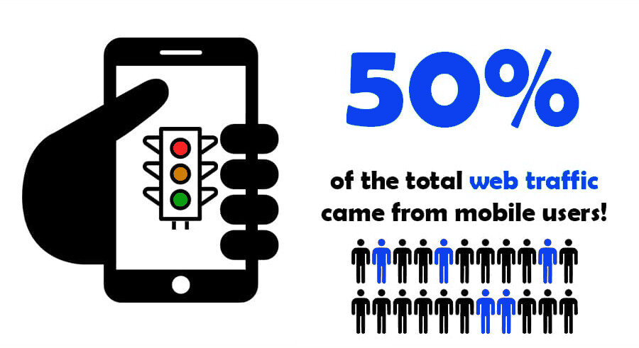
Google prioritises mobile websites for you. It improves user experience, ensures faster loading times, and improves accessibility. With over half of all global web traffic coming from mobile devices, Google’s algorithms favour mobile-friendly sites, ensuring website owners meet user expectations for speed and responsiveness.
So, is Google really prioritising mobile websites to force continuous improvement or is there more to it?

Who Benefits from Google’s Mobile First Algorithm
Google’s strategy to prioritise mobile-friendly websites is rooted in both improving service quality and a strategic business plan.
1. Improving User Experience
Mobile users expect quick, easy, and efficient access to information and services. By prioritising websites that are optimised for mobile, Google ensures that its users are more likely to have a positive experience.
This is crucial because a satisfied user is more likely to return and use the service again. Mobile optimisation includes readable text sizes, accessible navigation, and fast-loading pages, which significantly enhance the overall user experience. It’s ensuring good SEO and UX practices across all mobile pages.
2. Aligning with User Behaviour
The majority of internet users now access the web via mobile devices. Google’s emphasis on mobile SEO ensures that search results are directly aligned with the majority of user behaviours and preferences.
This alignment helps maintain Google’s position as the number one search engine because it delivers the most relevant and user-friendly results, regardless of device.
3. Encouraging Modern Web Practices
Google is nudging developers and businesses towards adopting modern web standards and practices.
This includes responsive design, fast loading times, and mobile-first indexing. The push for these practices not only improves the web ecosystem as a whole but also encourages the creation of websites that are accessible and efficient across all platforms.
4. Driving Ad Revenue
Google benefits massively from prioritising mobile-optimised websites.
Mobile users are more likely to engage with ads and perform transactions on sites that are optimised for their devices. By providing a superior mobile experience, Google maximises the effectiveness of its ads and, consequently, its advertising revenue.
Advertisers are more inclined to invest in a platform that focuses on a mobile audience, leading to more ad spend on Google’s networks and more money in Google’s pockets.
5. Benefiting Website Owners
Website owners benefit significantly from aligning with Google’s mobile SEO first approach. Mobile-optimised sites tend to have lower bounce rates and higher conversion rates.
These sites engage users more effectively and keep them on-site longer, which can lead to increased sales, more ad revenue, and greater brand loyalty. Additionally, appearing higher in search results increases visibility, driving more organic traffic to these websites.
Google essentially creates an ecosystem where end-users receive a seamless browsing experience, advertisers achieve higher engagement rates, and website owners enjoy better search visibility and traffic quality.
Using Google’s Mobile-First Focus to Boost Your SEO
1. Conduct a Mobile-Friendly Audit
Start by using tools such as Google’s Mobile-Friendly Test to evaluate your website. Implement any suggested changes to enhance compatibility and performance on mobile devices.
2. Adopt Responsive Design
Ensure your site is responsive; it should fluidly adapt to different device screens. This includes simplifying the user interface, optimising image sizes, and streamlining content presentation for quick, easy consumption.
3. Invest in Speed
Emphasise fast loading times by optimising images, leveraging browser caching, and reducing reliance on heavy scripts. Every second reduced from your loading time can significantly improve user retention and satisfaction.
4. Enhance User Interactions
Focus on the mobile user journey by designing for touch and minimising the need for typing. Make sure key information and calls to action are front and centre, easy to tap, and uncomplicated.
5. Keep Testing and Updating
The mobile landscape is ever-evolving, with new devices and browser updates emerging regularly. Keep your site up-to-date with the latest mobile standards and continuously test its performance and usability across a range of devices.
Understanding Mobile SEO
Mobile SEO refers to the process of optimising your website to rank well in search engine results on mobile devices.
Given the differences in how users interact with mobile versus desktop platforms, and how Google indexes mobile sites, certain unique considerations come into play. Here’s a deeper look at how mobile SEO differs from traditional SEO and some practical tips to optimise for mobile:
Key Differences in Mobile SEO
User Behaviour: Mobile users often seek quick answers and exhibit different search patterns, including the use of voice search and local intent more frequently than desktop users.
Technical Requirements: Mobile SEO requires a focus on technical details like responsive design, touch-screen friendly interfaces, and faster load times due to generally slower and less stable mobile internet connections.
Content Presentation: The content on mobile needs to be concise yet informative, as mobile screens offer limited space. Prioritising content that delivers value at a glance (like bullet points and summarised sections) is crucial.
Local SEO Emphasis: Mobile searches are more likely to be local. Users often look for services or products near them, which means local SEO is even more important in mobile.
Understanding these differences will help you optimise your website for the best possible performance on mobile devices, enhancing both user experience and search engine visibility.
