
Hey there, mobile mavens! Are you ready to take your website to the next level and attract more visitors than you can handle? Well, buckle up because we’re about to dive into the exciting world of mobile SEO.
In this day and age, mobile optimization is more critical than ever. With the majority of internet users accessing the web through mobile devices, it’s vital to ensure your website is optimised for mobile search engines. But, where do you start, and what exactly is mobile SEO?
Don’t fret! We’ve got you covered. In this essential guide to mobile SEO for beginners, we’re going to break down the basics, give you some practical tips, and provide you with the knowledge you need to dominate the mobile search rankings.
What is Mobile SEO
Mobile SEO is the process of optimising your website to be mobile-friendly, ensuring that it’s fast, accessible, and easy to use on a variety of mobile devices. The benefits of mobile optimization go beyond just reaching more users; it can also significantly impact your search engine rankings. In fact, Google’s algorithm now prioritises mobile-friendly websites in its search results, meaning that if your website isn’t optimised for mobile, you could be losing out on valuable search engine traffic.
So, whether you’re running an online store or a blog, optimising your website for mobile is essential in today’s digital age. By doing so, you can increase your website’s visibility, attract more visitors, and ultimately, drive more conversions.
Did you know that over 60% of online searches are now conducted on mobile devices? And, according to recent studies, mobile searches are more likely to result in a purchase than desktop searches.
Design Dictates Desire
“Design dictates desire” is a phrase often used in the world of marketing and design to emphasise the importance of creating visually appealing and user-friendly products or websites that can attract and retain customers.
In today’s fast-paced digital world, users are constantly bombarded with information and options, making it essential to capture their attention quickly and effectively.
With more and more mobile users a well-designed mobile website can differentiate itself from the competition, create a memorable user experience, and ultimately drive customer loyalty.
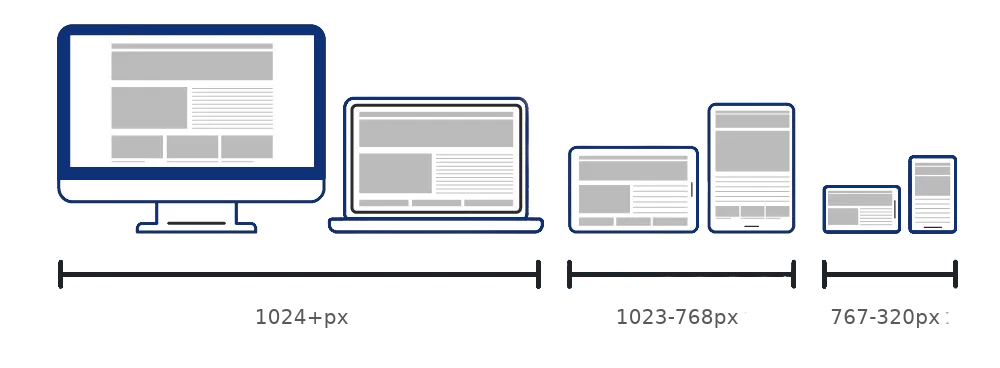
To achieve a good mobile design, there are three main options to consider: responsive design, dynamic serving, and a separate mobile URL or domain.
Responsive Design
Responsive design is a popular approach that involves creating a single website design that can adapt and adjust to fit the screen size and resolution of any device.
This means that the same HTML and CSS code is delivered to all devices, but the design adjusts to provide an optimal viewing experience on each device.
Advantages
- Provides a consistent user experience across all devices
- Requires only one URL and one set of HTML and CSS code, making it easy to maintain and update
- Is favoured by search engines, as it makes it easier for them to crawl and index your site
Disadvantages
- Can sometimes result in slower load times on mobile devices, especially if large images or other media are not properly optimised for mobile
- May require more planning and design work upfront to ensure that the design translates well across all device sizes and resolutions
- May not be the best option for sites with complex layouts or unique design requirements for different devices
Dynamic Serving
Dynamic serving, on the other hand, delivers different HTML and CSS content based on the device accessing the website. This allows for more precise optimisation for each device, but can be more complex to set up and maintain compared to responsive design.
Advantages
- Provides more precise optimization for each device, potentially resulting in faster load times and a better user experience
- Allows for more flexibility in designing for different device types and sizes
- Can be a good option for sites with unique design or functionality requirements for different devices
Disadvantages
- Can be more complex to set up and maintain than responsive design
- Can result in higher development costs and longer timelines due to the need to create multiple versions of the site
- May not be the best option for smaller sites or those with limited resources
Separate Mobile URL/Domain
Finally, a separate mobile URL or domain involves creating a completely separate website that is specifically designed for mobile devices. This option provides the most control over the mobile experience, but can also be the most time-consuming and expensive to implement.
Advantages
- Provides the most control over the mobile experience, allowing for a completely custom design and layout for mobile users
- Can be a good option for sites with unique content or functionality requirements for mobile devices
- Can potentially result in faster load times and better performance on mobile devices
Disadvantages
- Can be expensive and time-consuming to implement, as it requires the creation of a completely separate website
- Requires ongoing maintenance and updates for both the desktop and mobile sites, which can be a significant undertaking
- Can potentially cause issues with duplicate content and SEO if not properly implemented and managed
The Need for Speed
Are you tired of waiting for a website to load on your mobile device? Well, you’re not alone! In fact, 53% of mobile site visits are abandoned if a page takes longer than three seconds to load. That’s why Google introduced its Core Web Vitals, which are a set of metrics that measure website loading speed, interactivity, and visual stability.
These metrics have become an important ranking factor for search engines, and it’s essential for website owners to optimise their sites for better performance. In this guide, we’ll explore the importance of Google Web Vitals and how to improve your website’s speed for a better user experience. So, let’s get stuck in!

LCP
LCP stands for Largest Contentful Paint, which is a metric that measures how long it takes for the largest element on a webpage to be rendered on the screen. This element could be an image, video, or block of text.
A good LCP score means that the webpage’s primary content loads quickly, which is essential for providing a positive user experience. Google recommends that websites aim for an LCP of 2.5 seconds or less to provide a good user experience.
How to Improve LCP
- Optimise images: Large, uncompressed images can significantly slow down a website’s loading speed. Optimising images by compressing them, reducing their size, and using appropriate image formats can improve LCP.
- Minimise render-blocking resources: Render-blocking resources like CSS and JavaScript can prevent the browser from rendering the page’s primary content, leading to a slow LCP. Reducing the number of render-blocking resources or loading them asynchronously can help improve LCP.
- Use a Content Delivery Network (CDN): A CDN can help distribute website content across different servers, reducing the time it takes for the browser to download the page’s resources.
- Prioritise visible content: It’s essential to prioritise the page’s primary content, so it’s loaded first. Using lazy loading for non-critical resources can also help improve LCP.
By implementing these optimizations, website owners can improve their LCP score, resulting in a better user experience and potentially higher search engine rankings.
FID
FID stands for First Input Delay. It is a measure of the time it takes for a website to respond to the first interaction from a user, such as a click or tap.
A long FID can result in a delayed response to user input, which can lead to a poor user experience. FID is measured in milliseconds and is an important metric for assessing the interactivity of a website.
Google recommends that websites aim for an FID of less than 100 milliseconds for a good user experience.
How to Improve FID
- Optimise your code: Make sure your code is lean and optimised for fast load times. Use minified JavaScript and CSS files and remove any unnecessary code.
- Use a Content Delivery Network (CDN): A CDN can help reduce the time it takes to load content by serving it from a server closer to the user.
- Minimise third-party scripts: Third-party scripts, such as those used for analytics or advertising, can slow down your website. Try to minimise their use, or defer them until after your website has loaded.
- Optimise images: Large, uncompressed images can take a long time to load. Optimise your images by compressing them and using the appropriate file format for the type of image.
- Use browser caching: Caching can help reduce the load time of your website by storing commonly used files, such as images and JavaScript, in the user’s browser cache.
- Prioritise above-the-fold content: Make sure the most important content on your website, the content that is visible without scrolling, is loaded first.
By implementing these techniques, you can improve the FID of your website and provide a better user experience.
Additionally, focusing on FID can help you meet Google’s Core Web Vitals standards, which are becoming increasingly important for search engine rankings.
CLS
CLS stands for Cumulative Layout Shift. It is a metric that measures the visual stability of a website during loading.
In other words, it measures how much the elements on a page move around as it loads. A high CLS score indicates a poor user experience as it can lead to frustration and confusion for users.
How to Improve CLS
- Use appropriate dimensions for images and videos: Make sure to specify the dimensions for all media elements on the page so the browser can reserve the correct amount of space for them.
- Avoid adding new content above existing content: This can cause the page layout to shift, especially if the user is in the middle of reading the page.
- Use CSS animations wisely: Animations can be eye-catching, but they can also cause layout shifts. If you need to use animations, make sure to reserve enough space on the page for them.
- Load third-party content asynchronously: Third-party content, such as ads or social media widgets, can cause layout shifts. To prevent this, load them asynchronously so they don’t affect the page layout until they’re ready.
- Preload critical resources: Preloading critical resources, such as fonts and CSS files, can help speed up page loading and prevent layout shifts.
By following these tips, you can improve your CLS score and provide a better user experience for your website visitors.
Not Sure Where to Start?
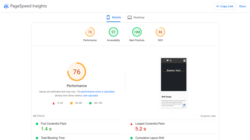
If you’re feeling unsure about where to start with optimising your website’s speed for mobile devices, a good place to begin is by using Google’s PageSpeed Insights tool.
This resource provides a comprehensive breakdown of your website’s speed and performance, giving you insights into which areas could use improvement.
By simply entering your website’s URL into the tool, you’ll receive detailed feedback and recommendations for enhancing your site’s speed and user experience, helping you to get started on the right track toward better mobile performance.
Help the Crawlers
When you type something into a search engine like Google, it sends out little bots (also known as spiders) to crawl all over the internet and look for relevant web pages to add to its index. The index is like a giant database that holds information about all the web pages that Google has found.
Now, when it comes to mobile web development, crawl-ability and indexing refers to how easy it is for these bots to access and read your website’s content.
Essentially, you want to make sure that your mobile website is designed in a way that makes it easy for these bots to crawl through your site and index your pages.
This is important because if the bots can’t crawl and index your pages, your site won’t show up in search engine results.
So, it’s crucial to optimise your mobile website for crawl-ability and indexing so that search engines can easily understand what your site is all about and show it to users who are searching for related information.
Site Structure
Ah, site structure! It’s like the foundation of a house – if it’s shaky, everything else will be too. To build a sturdy structure, you need to have a clear hierarchy and organisation in place.
Think of it like sorting your wardrobe – you’ve got your categories, subcategories, and tags to keep everything in order. And just like your wardrobe, your website needs a logical navigation menu that helps users easily find what they’re looking for.
Avoid using boring URLs like “page-1” and make sure your users can access any page within just a few clicks. After all, if a user can’t find what they’re looking for quickly and easily, what’s the point?
Developers call this internal linking, and it’s a key part of optimising your site’s structure. It means linking to relevant content within your site, using descriptive anchor text, and making sure there are no broken links.
Having a well-structured site not only helps with crawlability and indexing, but also provides a much better experience for your visitors. So let’s tidy up that closet, I mean, site structure!
Robots & Sitemaps
The age-old question: what’s the deal with sitemaps and robots.txt?
First, let’s start with sitemaps. A sitemap is essentially a roadmap for search engines to follow, outlining all of the pages on your website. Think of it as a directory or index for your website.
By submitting a sitemap to Google, you are giving them a better idea of how your website is structured and what content is available on it. This can help with indexing and ranking your website.
Now, on to robots.txt. This is a file that tells search engines which pages or areas of your website they should or should not crawl. It’s like a bouncer at a club, deciding who gets in and who doesn’t.
By controlling what search engines can and can’t access, you can help ensure that only the most important pages on your site are indexed and displayed in search results.
But be careful with robots.txt – if you block too many pages, you may actually be hurting your SEO efforts by preventing important pages from being indexed. It’s important to understand how to use robots.txt effectively and to make sure it’s set up correctly.
In short, sitemaps and robots.txt are important tools for managing how search engines crawl and index your website. By using them wisely and strategically, you can help improve your website’s SEO and ensure that your content is being displayed in search results.
Keep Track Of Your Mobile Site
If you’re building a mobile website, you should always keep an eye on its performance to ensure that it’s working as intended. But how can you do that? Well, the answer is simple: monitoring!
Monitoring your mobile site is essential to identify its weaknesses and improve its performance. You want to make sure that your visitors are having a smooth and enjoyable experience, and tracking the right metrics can help you achieve that.
So, what should you monitor? Well, there are several things to keep an eye on, including load times, bounce rates, and conversion rates. You can use tools like Google Analytics and Google Search Console to track these metrics and gain insights into how your site is performing.
It’s also important to check your site for any technical issues that may be affecting its performance, such as broken links or incorrect redirects. You can use tools like Screaming Frog or Ahrefs to crawl your site and identify any issues.
When monitoring your site, it’s important to be consistent and track changes over time. This will allow you to see the impact of any changes you make to your site and identify trends or patterns.
Before You Go
In this blog, we discussed the importance of optimising your website for mobile devices. We covered the three main options for achieving a good mobile design: responsive design, dynamic serving, and different URL/domain.
We also talked about the need for speed optimization, focusing on Google Core Web Vitals, including LCP, FID, and CLS, and provided tips on how to improve each.
We highlighted the significance of crawlability and indexing, emphasising the need for a clear site structure, internal linking, and sitemaps/robots.txt files. Finally, we stressed the importance of monitoring your mobile site’s performance to find weaknesses and improve.
Remember, mobile users are increasing every day, so it’s crucial to provide them with a seamless and enjoyable experience. Use the tips and tools provided in this blog to ensure your site is optimised and stays ahead of the competition. And always keep track of your site’s performance to make sure it’s up to par.
And with that, we’re done! Thanks for reading and remember to keep on optimising!
